
Data visualization
A selection of charts I have made in R, mostly with ggplot2. They cover Polish and Central and Eastern European macroeconomics, financial markets, elections and public health.
If you would like the code behind any of these, feel free to get in touch — I don’t usually keep these scripts on my GitHub.
Financial markets and investing
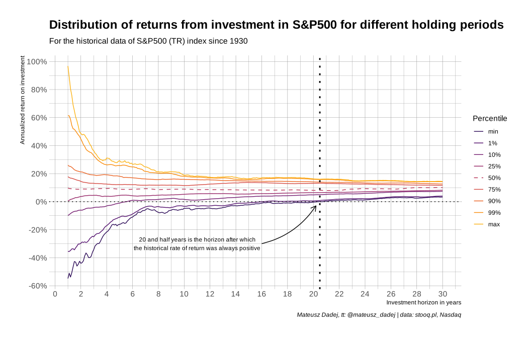
Distribution of returns from investing in the S&P 500 for different holding periods. Twenty and a half years is the horizon after which the historical rate of return was always positive. Data: stooq.pl, Nasdaq.
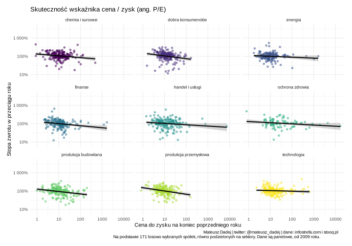
How well the price/earnings ratio predicts returns, by sector, on the Warsaw Stock Exchange. Based on 171 randomly selected companies, panel data since 2009. Data: infostrefa.com and stooq.pl.
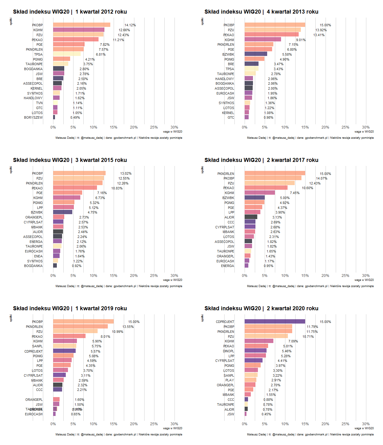
A bar chart race of the largest constituents of the WIG index on the Warsaw Stock Exchange.
Polish macroeconomy and society
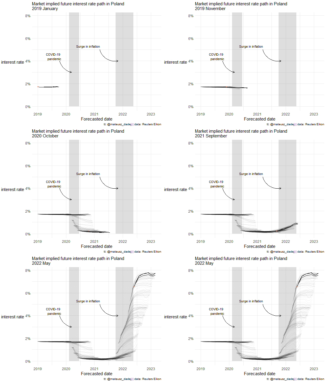
The WIBOR interest rate curve in Poland, animated over time.
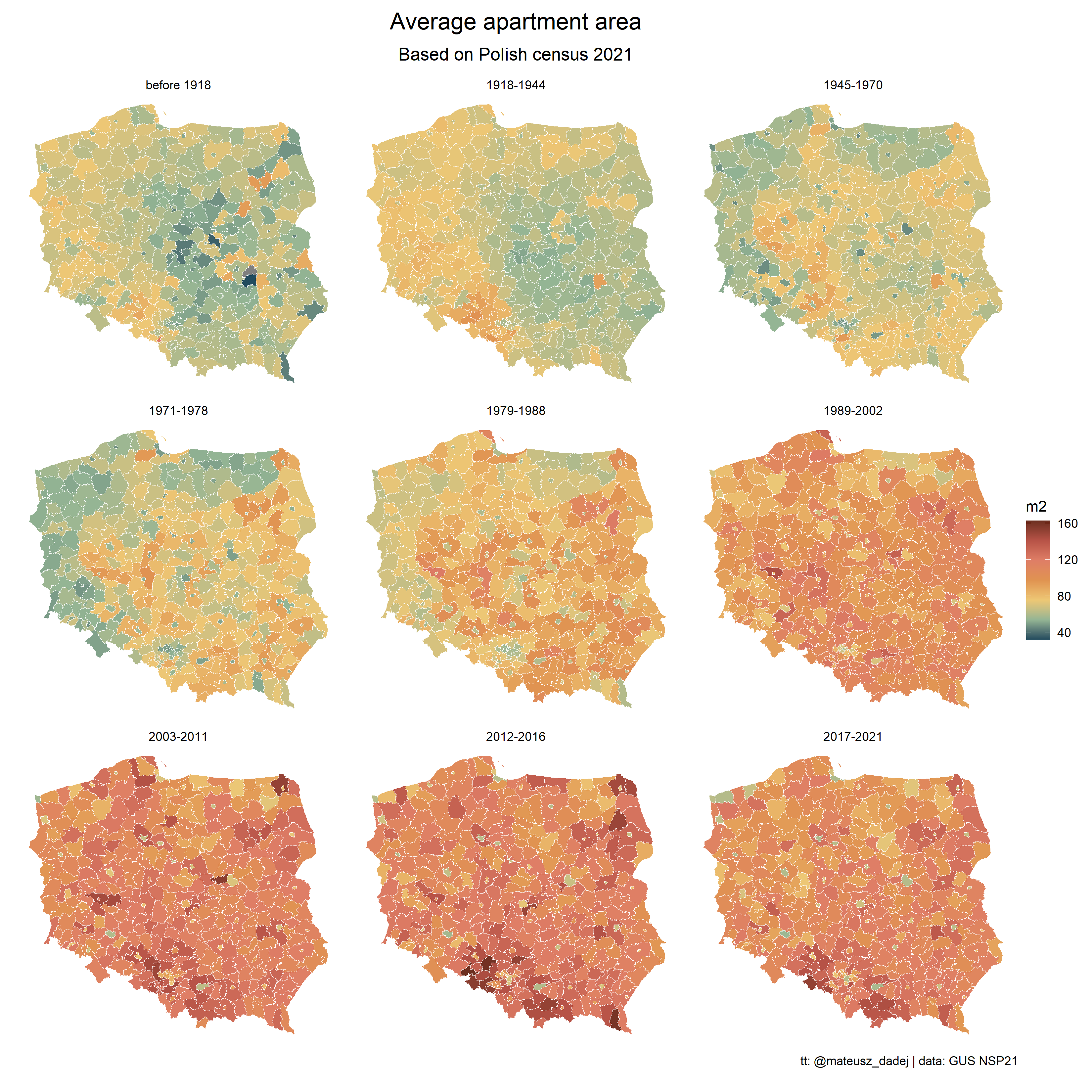
Average apartment area across Poland by the period in which the building was constructed. Data: Polish census 2021 (GUS NSP21).
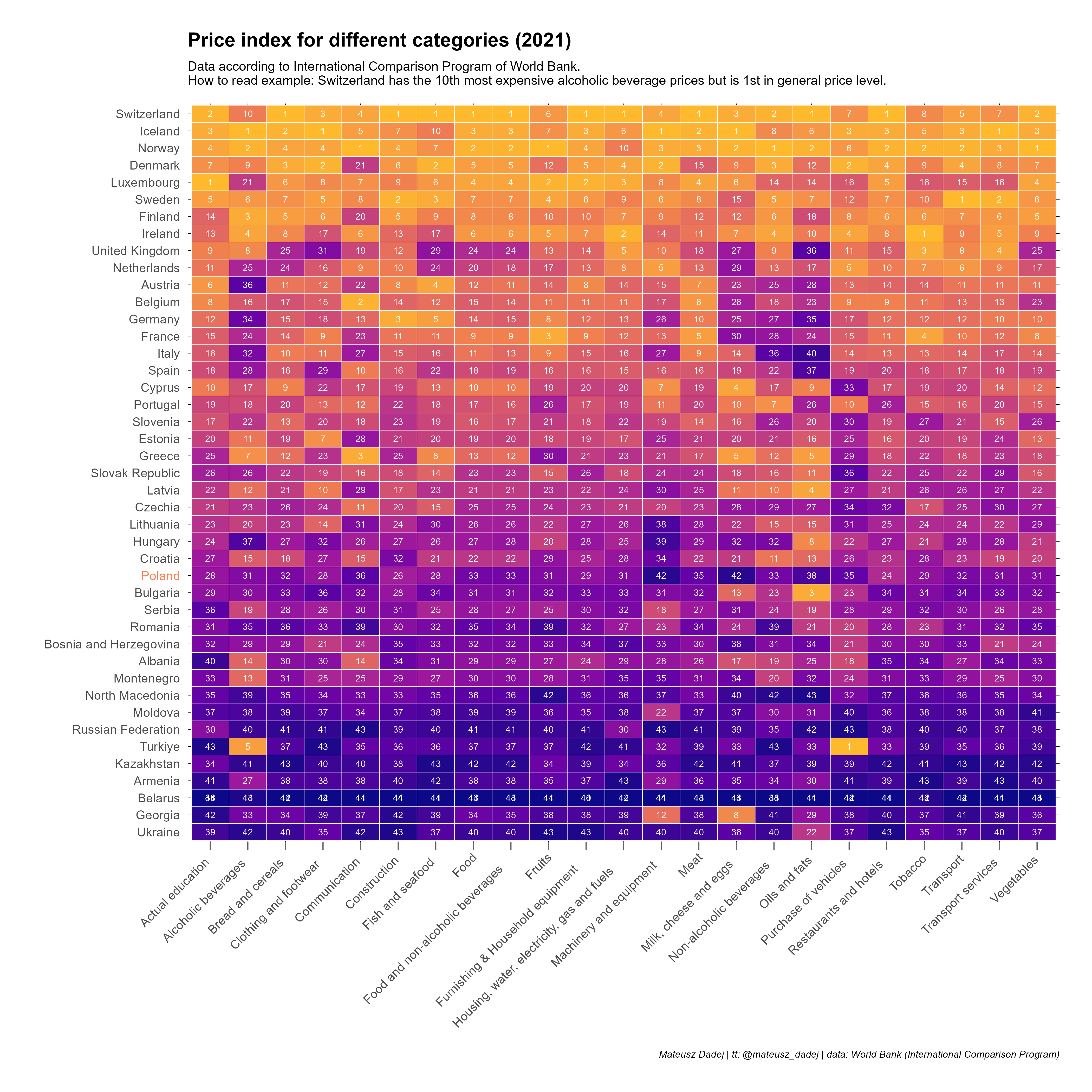
Price index by spending category, 2021. Switzerland has the tenth most expensive alcoholic beverages but the highest general price level. Data: World Bank International Comparison Program.
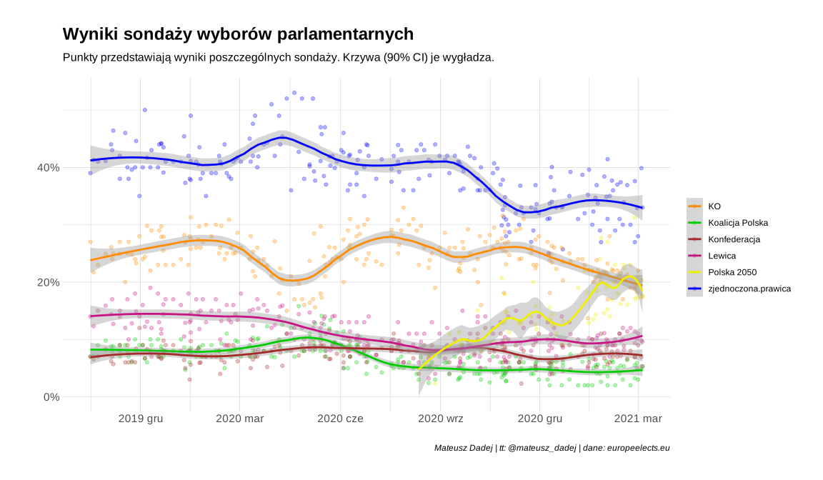
Polish parliamentary election polling. Points are individual polls; the curve smooths them with a 90% confidence interval. Data: europeelects.eu.
COVID-19 in Poland
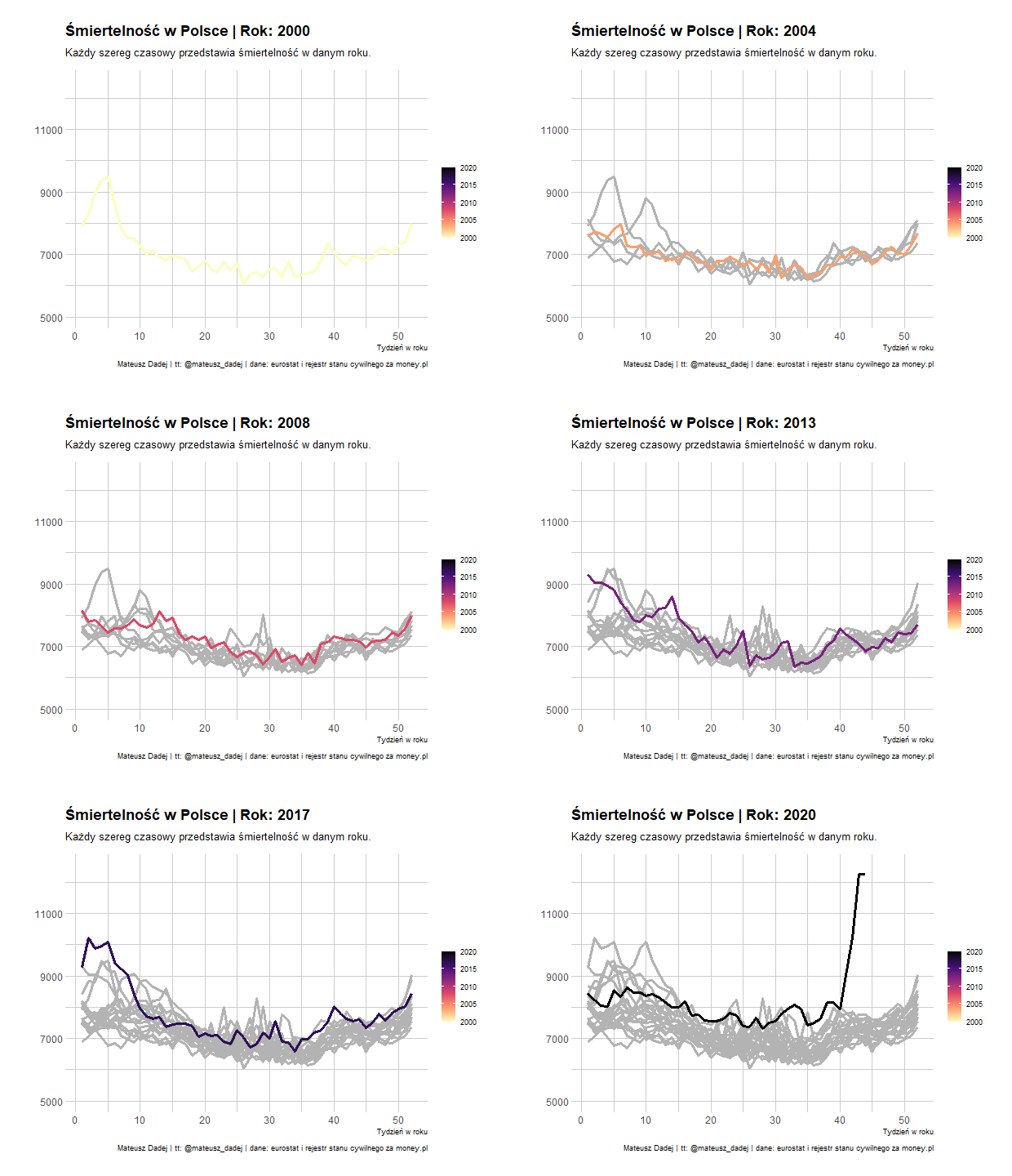
Mortality in Poland, one time series per year from 2000 to 2020. Data: Eurostat and the civil registry via money.pl.
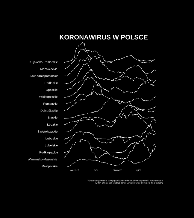
Coronavirus in Poland by voivodeship — a standardised two-week moving average, drawn to resemble the Joy Division “Unknown Pleasures” cover. Someone apparently made themselves a t-shirt of this one and sent me a picture of it.
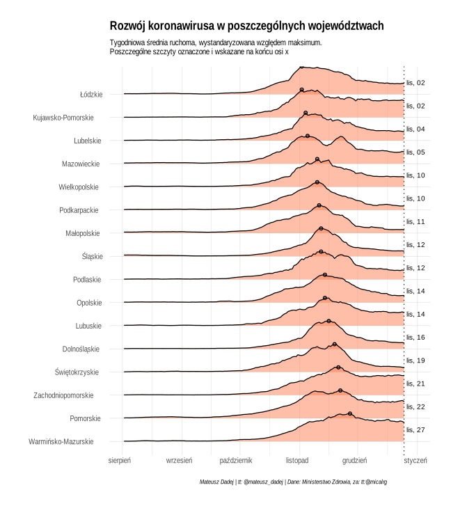
Coronavirus development by voivodeship, weekly moving average standardised against each region’s maximum. Data: Polish Ministry of Health.
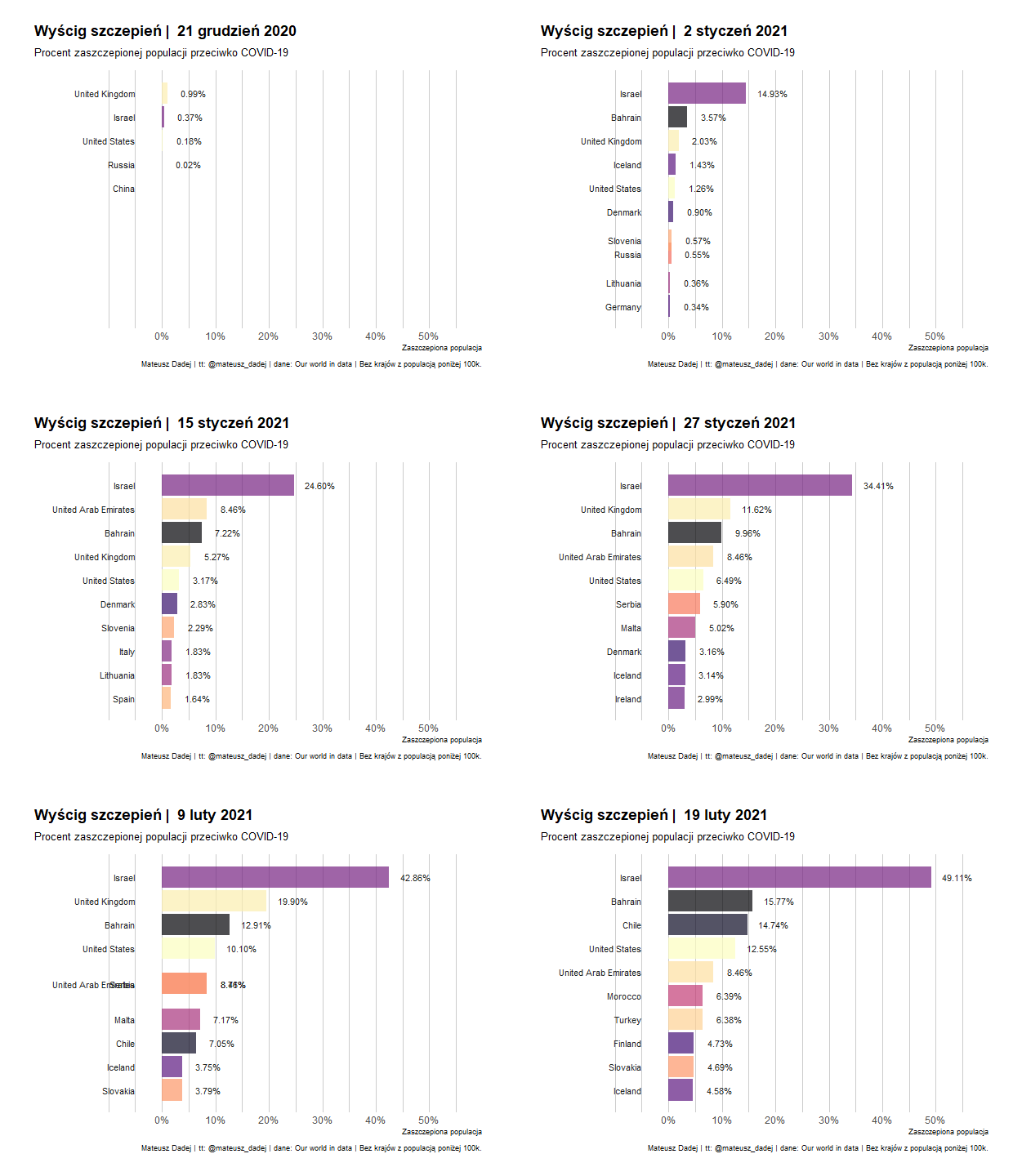
A bar chart race of COVID-19 vaccination rollout by country.
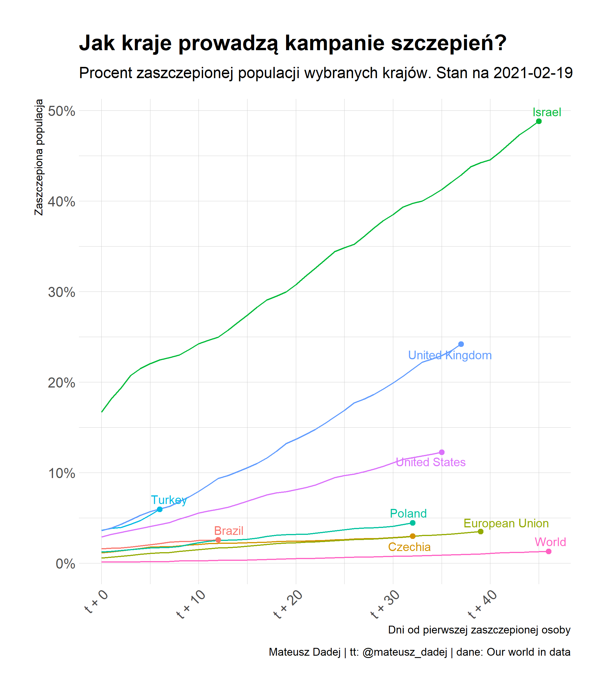
How countries ran their vaccination campaigns — share of population vaccinated against days since the first vaccinated person, as of 19 February 2021. Data: Our World in Data.
Europe
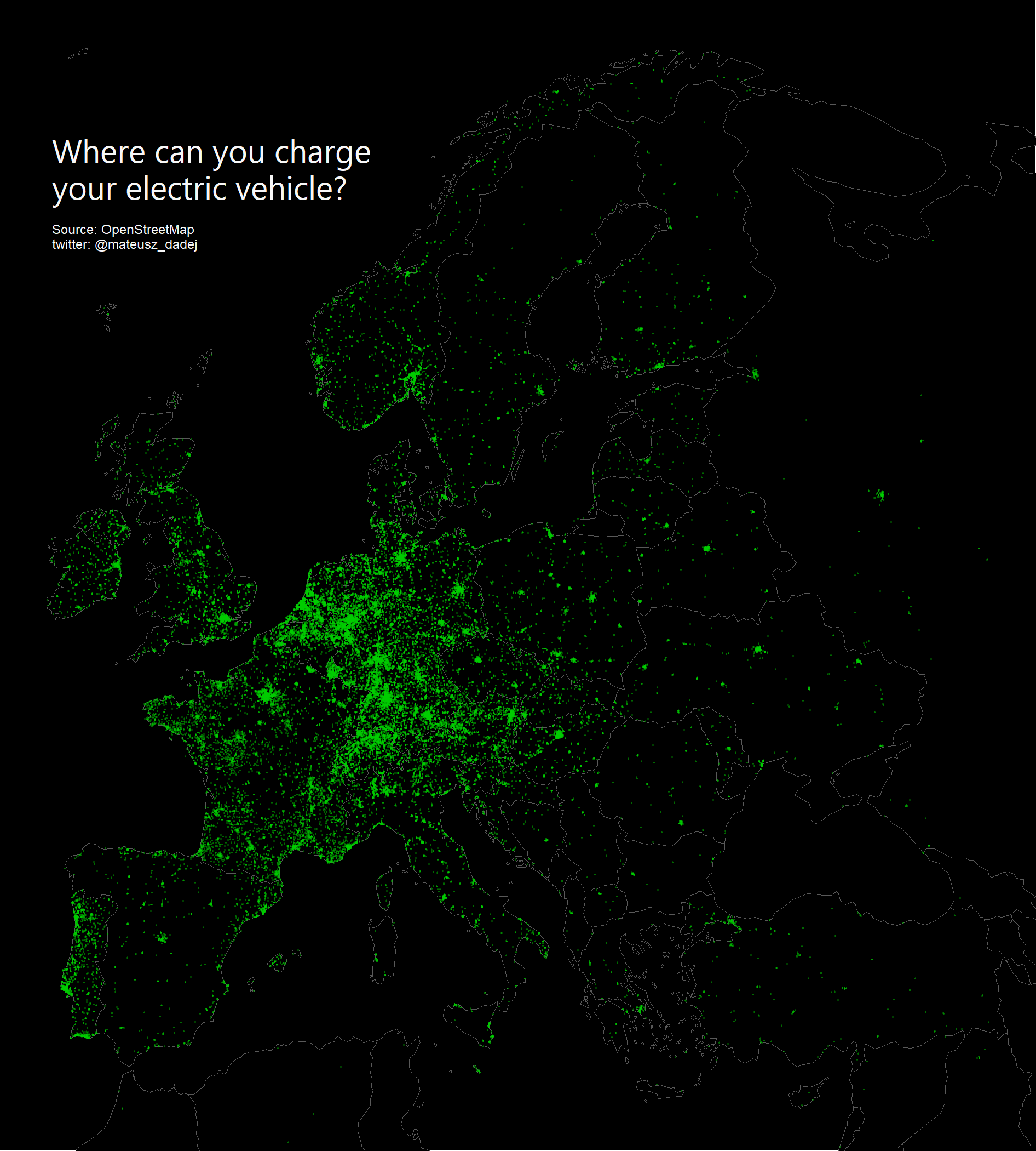
Where you can charge an electric vehicle in Europe. Data: OpenStreetMap.
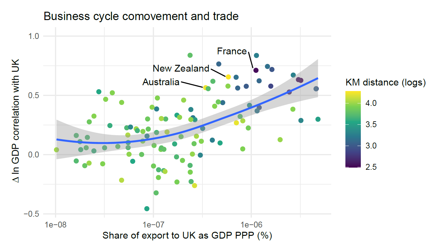
Business cycle comovement against trade intensity with the United Kingdom. This is the kind of question I look at in my paper on business cycle transmission between France and the United Kingdom, published in the Journal of Economic Studies.